
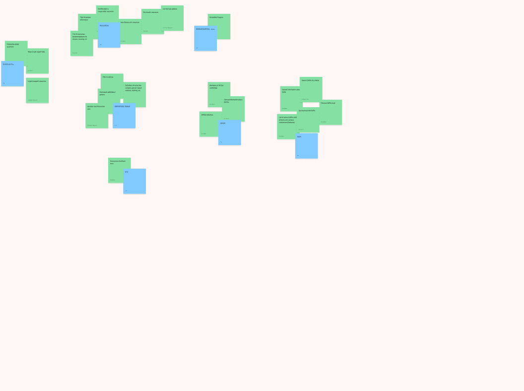
Prominent CTAs
The homepage immediately highlights the distinction between SAPA and SPCSA, featuring CTAs for immediate contact options. After handoff, a general resources link was also added.
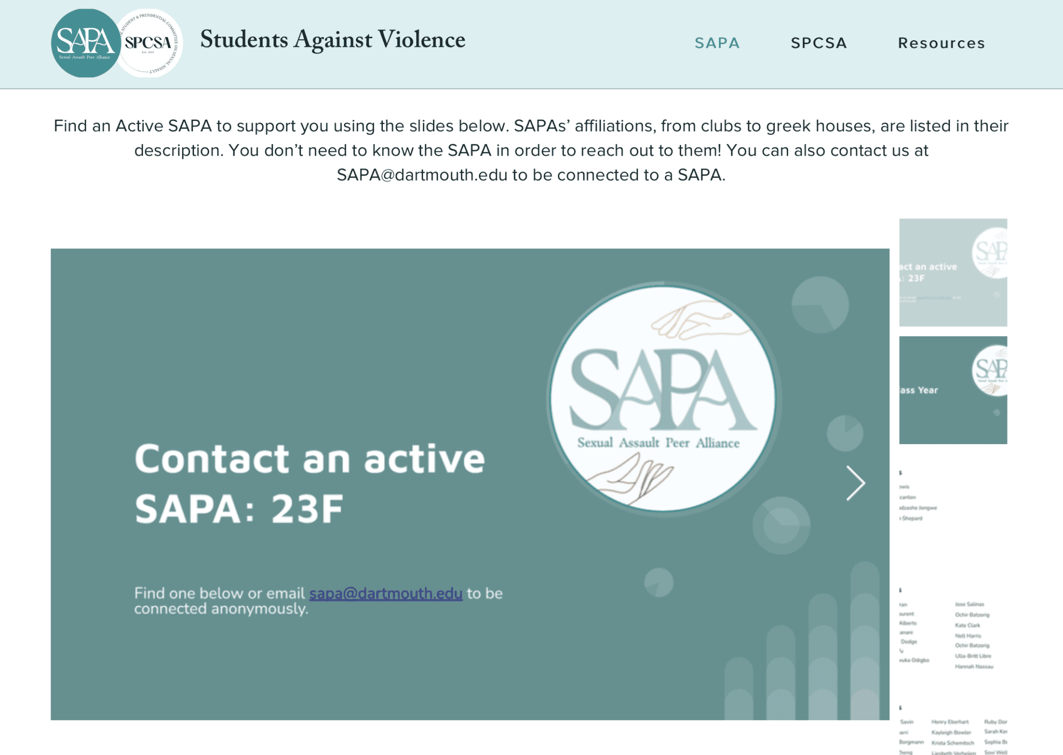
SAPA Support
As one of the main two pages, the SAPA page provides information on its mission and, most importantly, a regularly updated slideshow of all active members who can be a resource.

SPCSA Opportunities
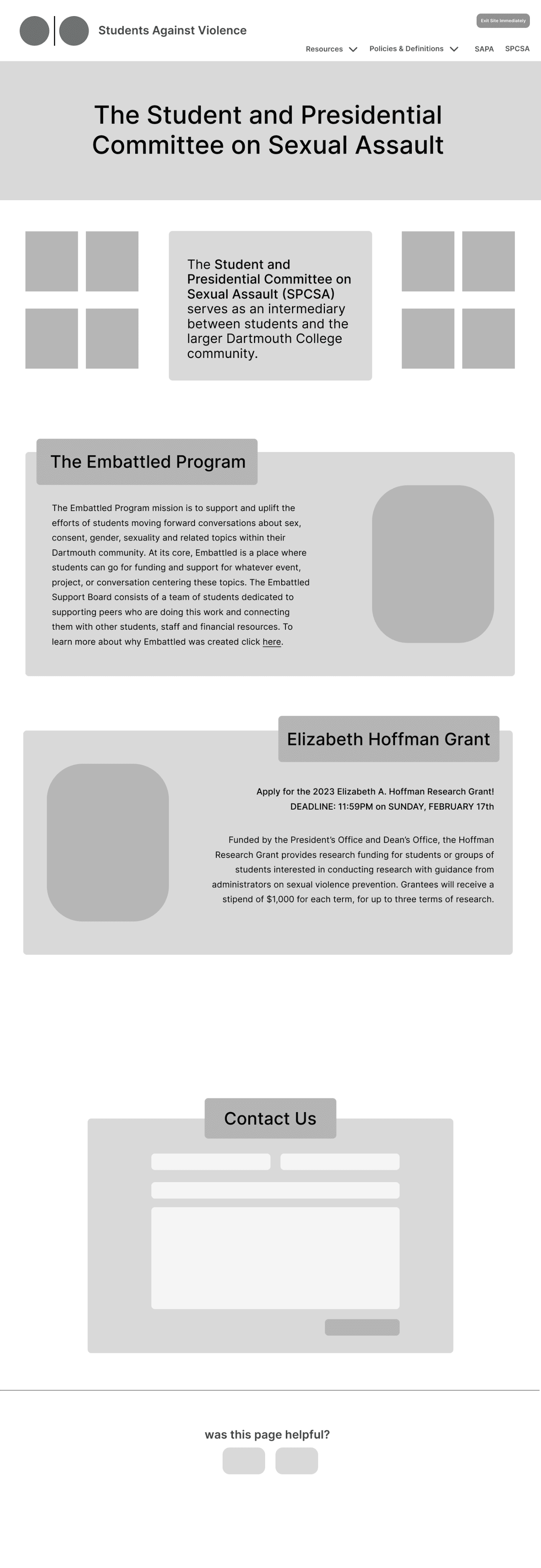
The SPCSA page features its ongoing and past projects, a research grant opportunity for independent gender-based violence research, and a community feedback form, offering students various avenues for support and involvement.
Consolidated Resources
The resource page empowers students to easily explore available support options and understand the difference between confidential and responsible employees. It offers a clear, accessible guide to all campus resources and how to reach out for help.

I helped design a website to enhance the digital visibility of Dartmouth's gender-based violence support groups and provide a centralized hub for critical resources and information.
Duration
10 weeks
Jun - Aug 2023
Team
3 designers
1 PM
Deliverables
Design System
Figma Prototype
Live Website
Role
UX
Visual Design
CHALLENGE
Dartmouth lacks a simple, centralized website with information on gender-based violence resources and student support organizations.
Dartmouth’s two main resources, the Sexual Assault Peer Alliance (SAPA) and the Student and Presidential Committee on Sexual Assault (SPCSA), lack an effective online presence. SAPA has no dedicated website, with limited information buried within Dartmouth Health Services, while SPCSA's site is overloaded with information and lacks hierarchy.
A website, where SAPA and SPCSA are unified under the name Students Against Violence, that ensures students can quickly find the support they need, from peer counseling services to reporting procedures, all in one place.
Talking with SAPA and SPCSA members, including executive leaders, allowed us to gain insights into their experiences with sexual violence prevention.
We researched existing gender-based violence prevention websites, specifically those for college students, to understand how they present resources.
In my interviews, I asked how individuals learned about these groups, their views on Dartmouth’s efforts to address sexual violence, and their awareness of available resources. Leveraging SAPA members’ trauma-informed training, I focused on how to create a safe and supportive user experience.
We interviewed 30+ Dartmouth students, including seniors nearing graduation, graduate students, and recent graduates who’ve joined the workforce.
Here are our three overarching takeaways from the competitive analysis and user interviews:
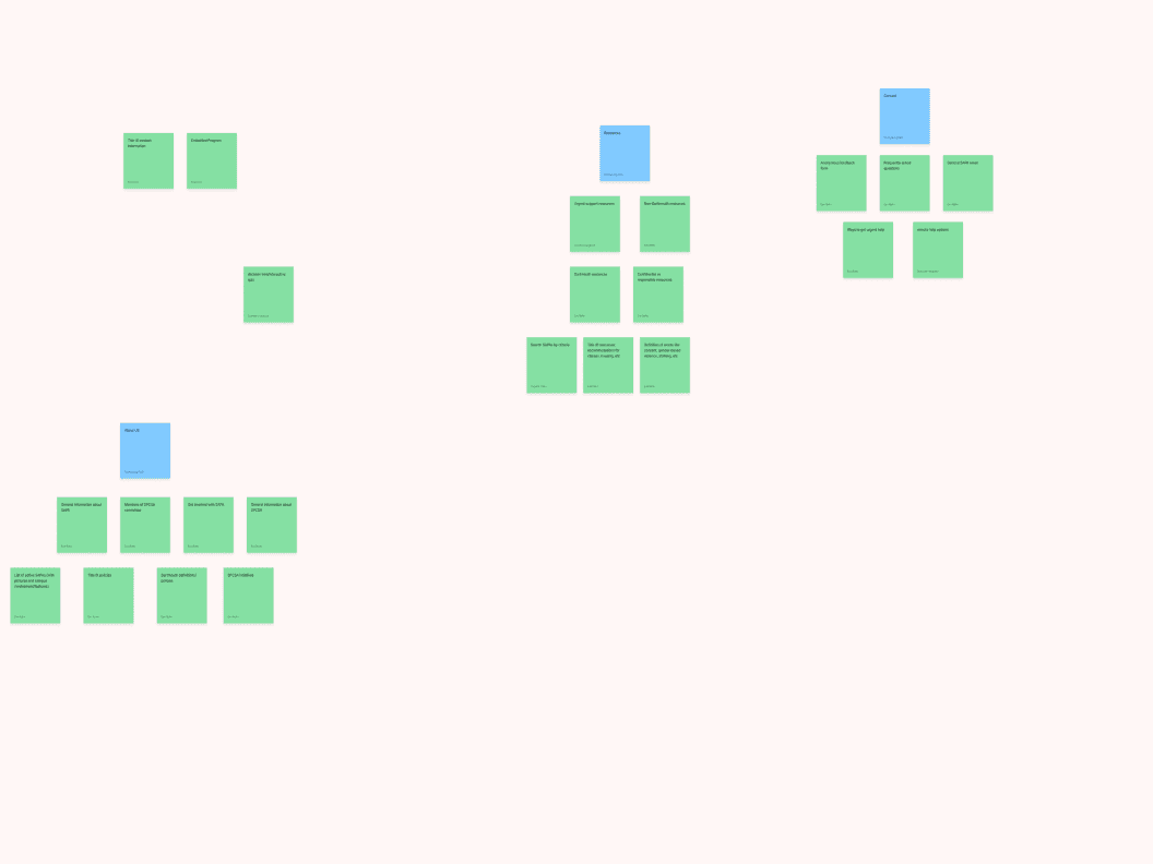
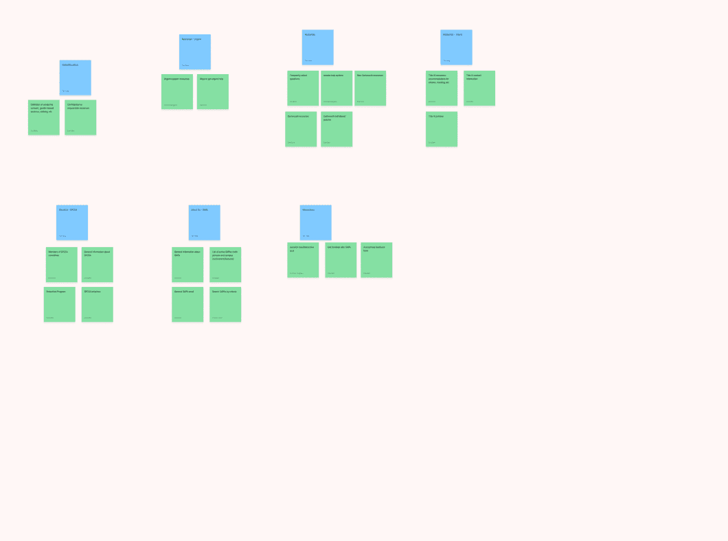
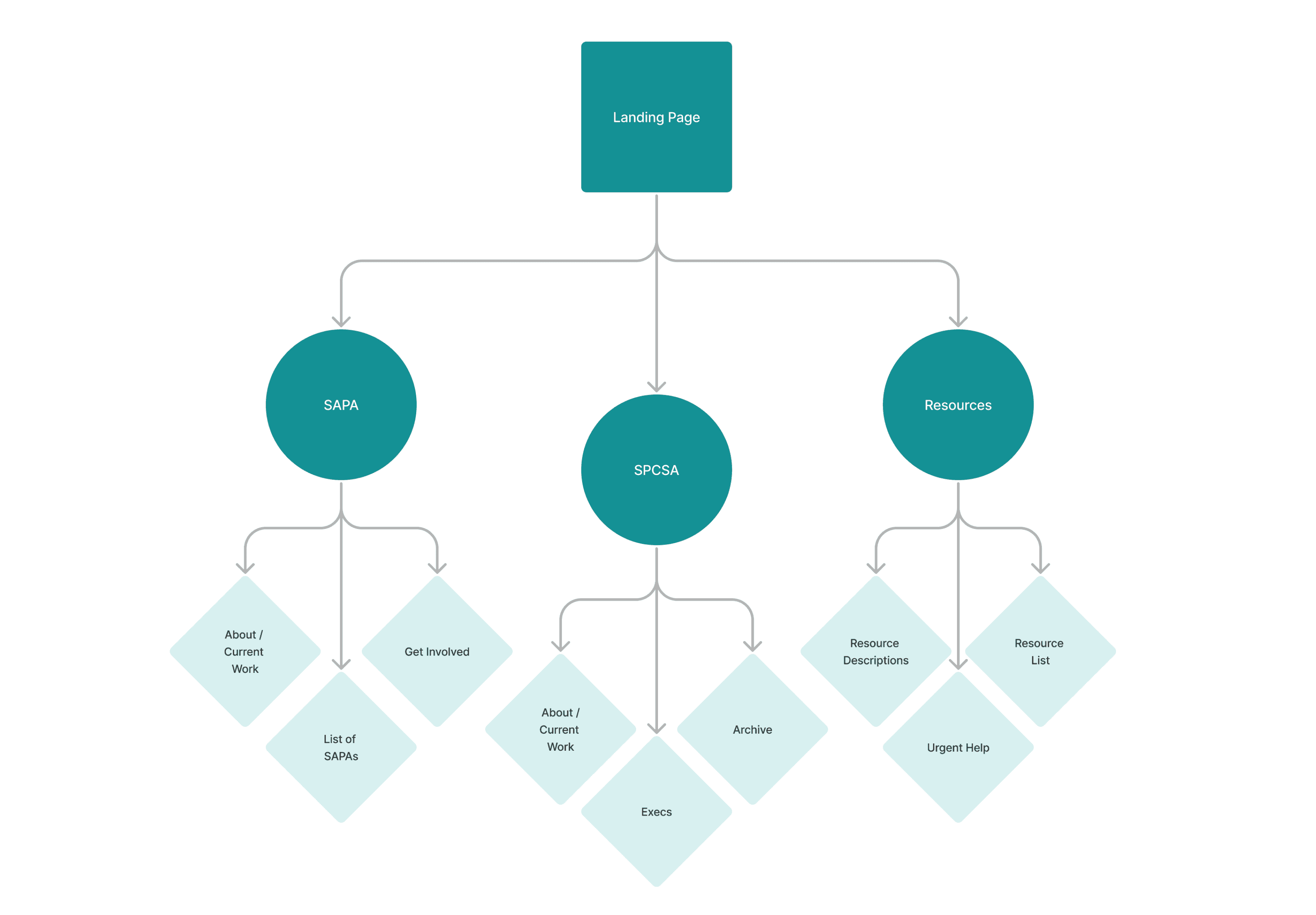
In our initial wireflow, we dedicated subpages to each section to manage the large amount of information. However, this deep site hierarchy makes it difficult for students to access essential information quickly and easily. We also faced friction when SAPA and SPCSA suggested prioritizing information about their organizations over the resource list for survivors.
We turned to card sorting with nine undergraduates to gain insights into their expectations for the site flow, website depth, and how to group information under appropriate labels. Similar to our user interviews, these participants had varying levels of familiarity with sexual violence resources on campus.
While this adds some scrolling, we felt it would improve the user experience with only two layers of depth. To address our earlier point of friction, we chose to feature the SAPA and SPCSA pages first, while keeping the resources page prominently in the navigation menu.
From our card sorting insights, we simplified our wireflow into a sitemap with three main pages—SAPA, SPCSA, and Resources—each with anchor links to consolidate information.
We centered our color scheme around teal to represent sexual violence awareness, with soft pastels for calming backgrounds. This creates a soothing and respectful atmosphere for students who are likely already feeling stressed or upset.
For fonts, Adobe Caslon is used for titles and headers, and Proxima Nova for body text. This combination keeps the site professional, clear, and easy to read.
Instead of continuing with our hi-fis and final prototype in Figma as usual before handing off to the client, my team and I switched to Wix. This allows SAPA and SPCSA to update the site independently in the future without needing design help. While we sacrificed some design flexibility, we prioritized long-term maintainability for the future of the site.
My team divided up the greyscales, each designing a page while all collaborating on the landing page. I focused on designing the SPCSA page. Below are my iterations.
I learned how to find a balance between my design ideas and the partners' needs, especially under tight deadlines. Some events of miscommunication were challenging, when our partners and I struggled to come to a consensus about what to prioritize, but this helped me improve my communication and taught me how to find solutions that work for everyone involved. If we had had more time, I would have liked to run usability tests with Dartmouth students before handoff to confirm the website doesn't have any gaps in meeting their needs.
Although the final Wix designs deviated from my initial hopes and expectations, this project strengthened my understanding of survivor-centric language and navigation.
OPPORTUNITY
Solution
Competitive
analysis
USER INTERVIEWS
TAKEAWAYS
Card Sorting
Site map
VISUAL DESIGN
SYSTEM
Greyscales
Reflection
Final Site
How might we simplify the way students find and engage with Dartmouth’s resources for addressing gender-based violence?
“We do so much work behind the scenes that isn't properly broadcasted right now.”
“Students looking at this site have gone through something traumatic, so it's crucial to make it a safe space.”
“If someone has experienced trauma, searching through a long list of contacts can be another toll.”
SAPA and SPCSA member quotes
#D9F0F0
#149195
#DCF0C7
#B23587
#FFE89E
#EADAF6
Aa
Adobe Caslon
Proxima Nova
Aa
Dartmouth students seeking sexual violence resources need a website that prioritizes clarity, and ease of use to support their search without overwhelming them.
Our industry research highlighted the need to prioritize survivor resources, making it challenging to balance these priorities.
POV Statement
WireFLOW


Having an "Exit site" button ensures users don’t feel stuck on the site if they’re triggered or overwhelmed.
Prominent CTAs are necessary for directing users to important resources without delay.
Supportive language, such as “you have options,” is crucial as it creates an environment in which users feel safe and understood during a vulnerable moment.


Resources
SAPA
SPCSA
Students Against Violence