Major Declaration Portal
Over 10 weeks, I worked with Dartmouth's Information, Technology, and Consulting (ITC) Services to redesign the portal where undergraduates submit and track major and minor declarations for department approval.
Duration
10 weeks
Jan - Mar 2023
Team
4 designers
4 developers
1 PM
Deliverables
Design System
Figma Prototype
Role
UX
Visual Design
CHALLENGE
The major declaration process at Dartmouth is a common source of frustration for students.
Students face difficulties finding the portal and getting their plans approved without excessive back-and-forth with faculty, adding stress during the already challenging process of choosing a field of study.
A redesigned portal, easily accessible in Dartmouth's student services hub, that offers intuitive tools and real-time course information to improve the likelihood of plan approval on the first attempt.
To better understand the challenges of the current declaration process, we walked through it ourselves, exploring what worked well and what could be improved.
We shared our individual experiences with academic planning, including using department resources and how we track our four-year plans.
Seeing visually overwhelming department resources, students’ reliance on disorganized spreadsheets, and flaws in the current portal’s UI, we turned to user interviews to hear firsthand experiences and learn how other universities approach major declaration.
We conducted 11 interviews with a Dartmouth professor, alum, Registrar employee, and students from Dartmouth, MIT, Vanderbilt, UT Austin, and Penn State.
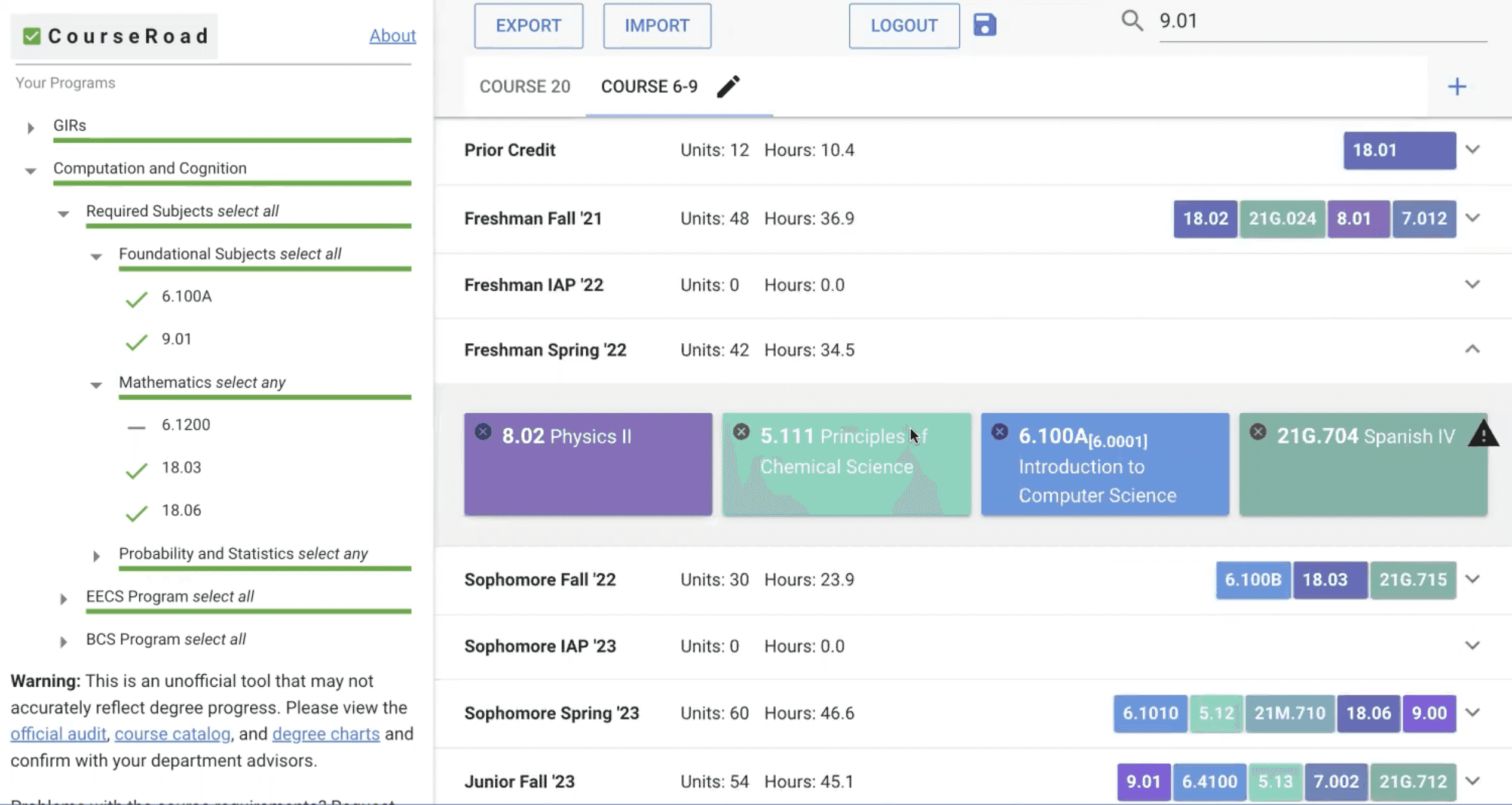
MIT's platform features a side panel listing major requirements and the courses that meet them.
Vanderbilt's platform uses a color-coded system (green for satisfied requirements and red for unsatisfied) with dropdowns providing extra course information. It also includes a "What if?" tool that compiles current courses to show progress toward other majors, minors, or modifications, allowing students to explore other majors seamlessly.
We combined our insights from user interviews with those from industry research, uncovering key takeaways about Dartmouth students’ major declaration experiences and how other institutions approach the process.
We kept these takeaways in mind while refining our flow sketches, regularly meeting as a team to discuss our ideas.
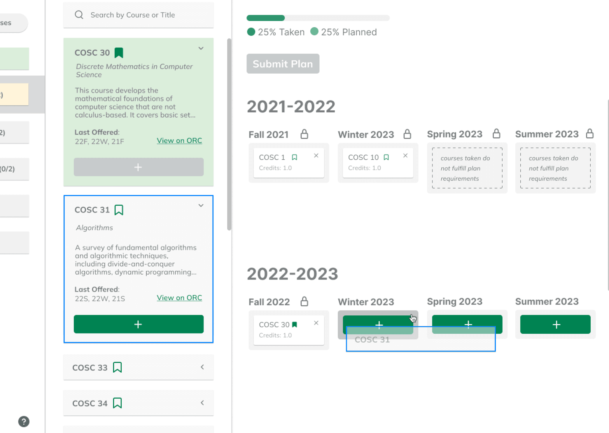
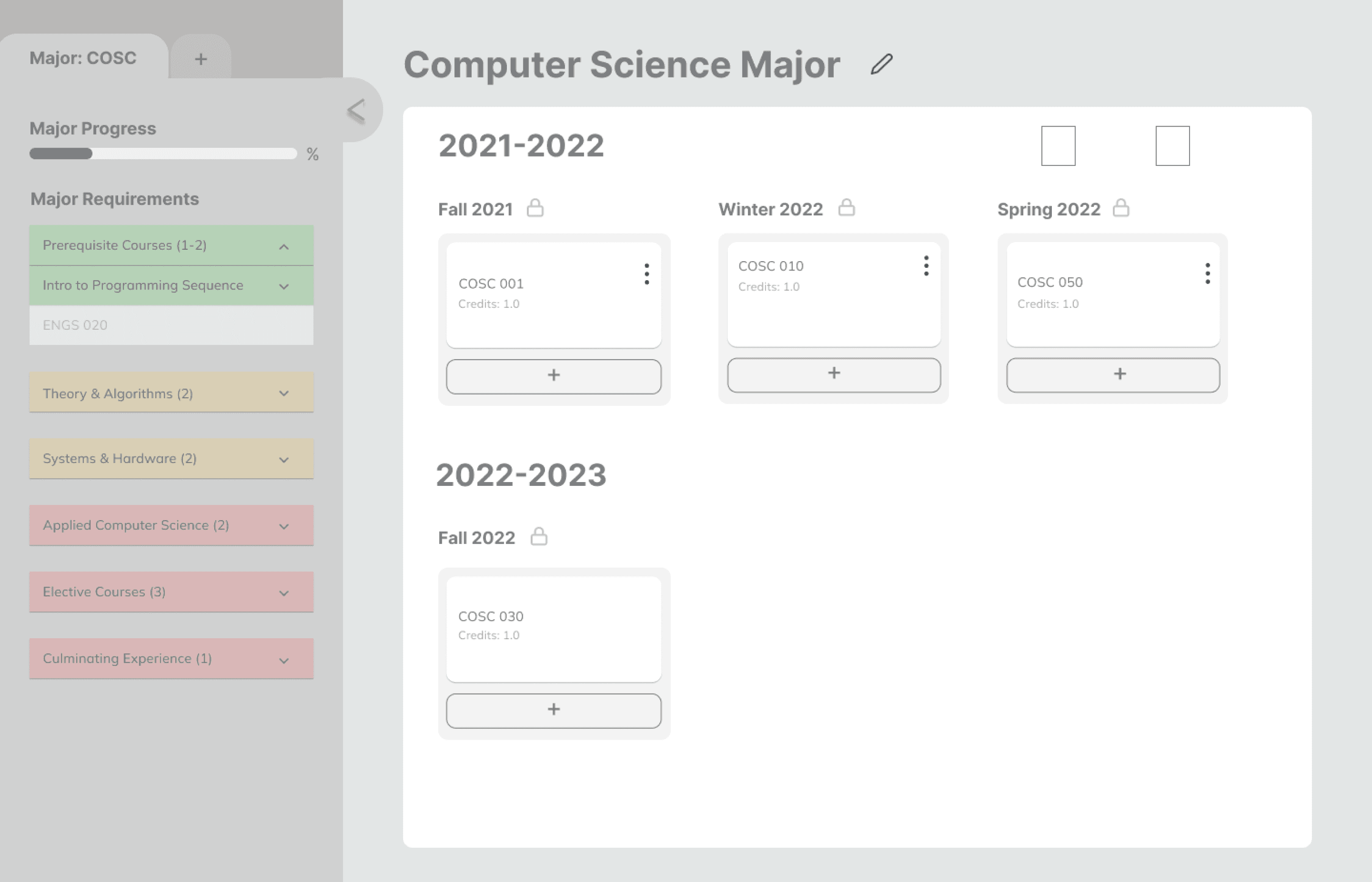
Each designer contributed to making greyscales, but I focused on the side panel layout, drawing inspiration from MIT’s portal. I experimented with different configurations: a single side panel on the right, one on the left, and panels on both sides. We decided to use two nested panels on the left in later hi-fis to accommodate multiple layers of information while avoiding the clutter of having panels on both sides of the screen.
I also introduced color-coding to the requirements list: red for "not started," yellow for "in progress," and green for "complete," which would update in real time as students add courses to their plan. However, we realized red might look like an error, so we replaced it with a neutral grey.
I suggested adding pre-submission warning pop-ups to flag common mistakes or errors that would prevent plan approval, reducing back-and-forth corrections.
Our hi-fis show the new designs in the same location, but with the name changed from “Plans” to “Declare.”
We adopted the color scheme of Dartmouth’s student services hub for consistency and used Inter for all text for its easy readability and simplicity.
The 10-week timeframe of this project made usability testing with Dartmouth students a challenge, forcing us to rely on internal testing. However, as my first UI/UX design project and debut at the DALI Lab, it was incredibly rewarding to enhance an experience I personally used and to create something my peers and future students would immensely benefit from. The portal requires minimal upkeep but holds significant potential for expanding its exploration features even further.
The redesigned platform streamlines the major declaration process, removing unnecessary back-and-forth corrections and providing students with an intuitive, few-click experience.

Students need all resources and information in one place.
Students need alerts for mistakes in their plans.
Students need tools that make exploring and planning alternative or additional academic paths easier.
OPPORTUNITY
Solution
INDUSTRY RESEARCH
USER INTERVIEWS
TAKEAWAYS
Flow Sketches
GREYSCALES
Hi-Fis
VISUAL DESIGN
SYSTEM
Reflection
Final prototype
How might we make it easier for students to navigate the major declaration portal?

Auto-Filled Course History
When students start the major declaration process, the system automatically fills in their completed courses, eliminating the need for manual entry.
Collapsible Side Panels
The collapsible sidebar allows students to easily access and exit a checklist of major requirements within the portal, eliminating the need to navigate external department websites.


Course Information + Bookmarks
A second panel provides course descriptions, term offerings, direct links to the course catalog, and options to bookmark courses, eliminating the need to search for this information or store it separately.
Drag and Drop
In addition to button clickthrough, students can easily arrange their course schedules using drag and drop, optimized for maximum accessibility.
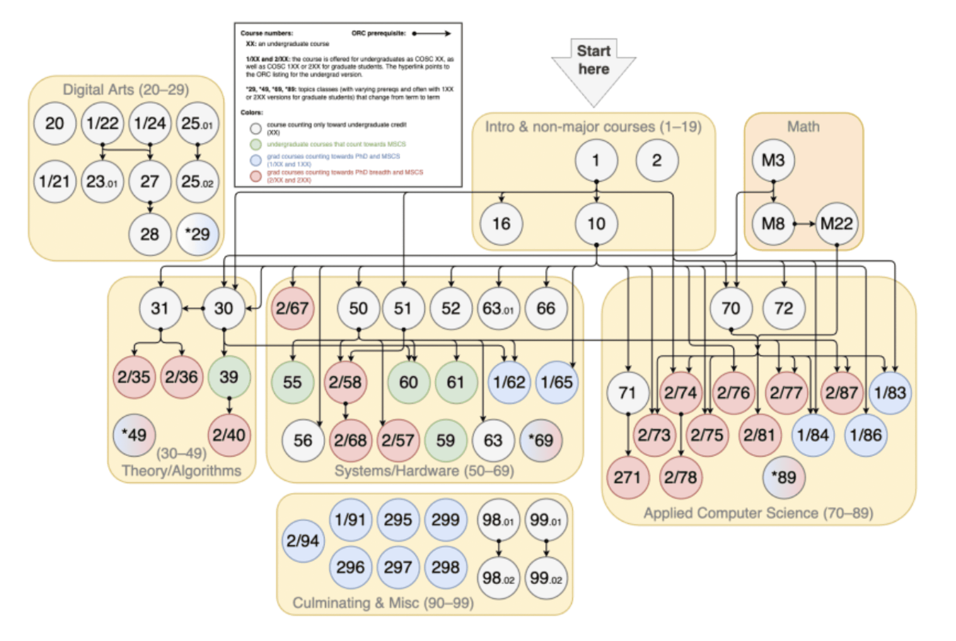
A visual map of the Computer Science major path at Dartmouth, available on the department website.
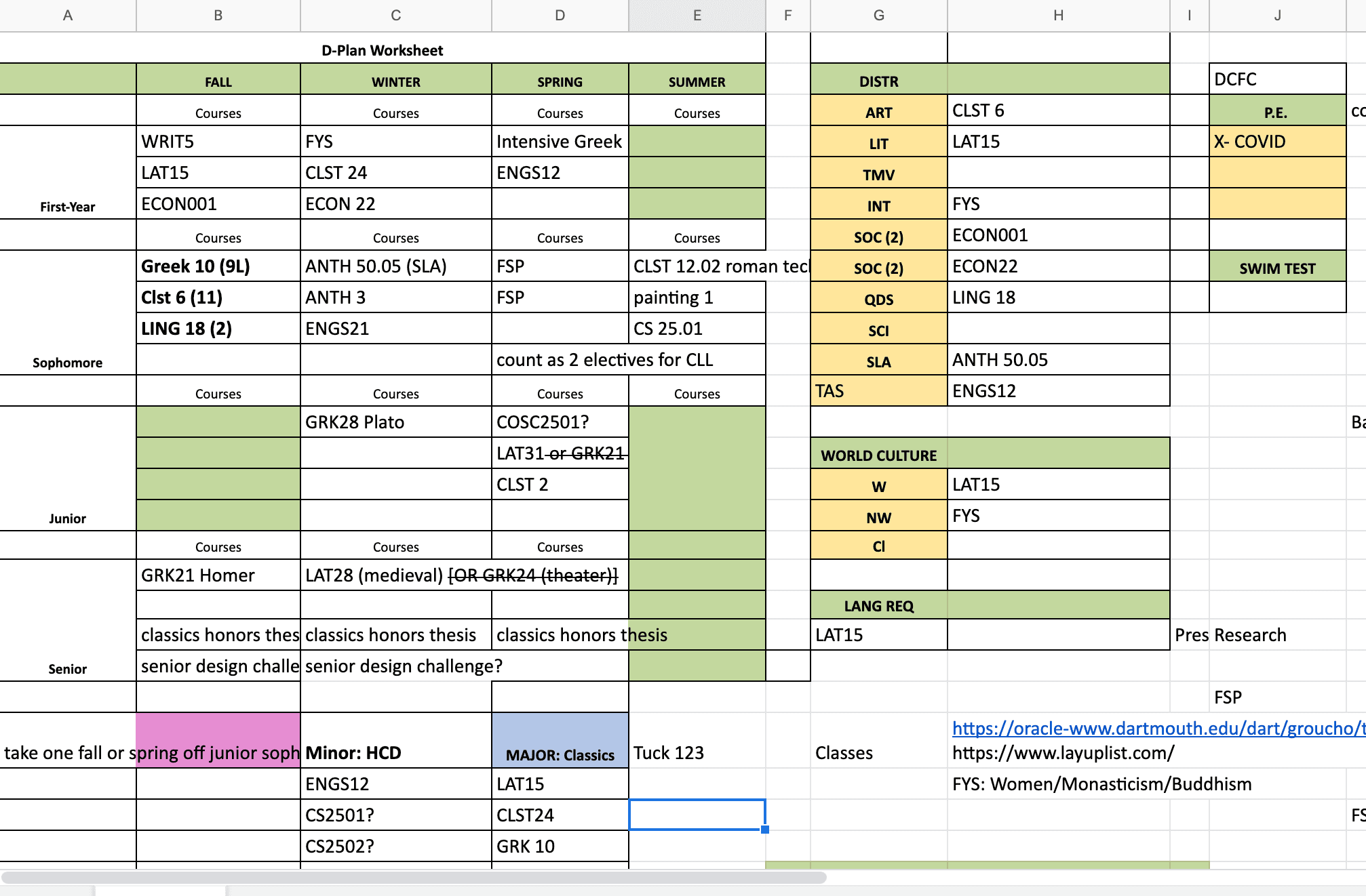
My teammate’s disorganized major tracker in Google Sheets.

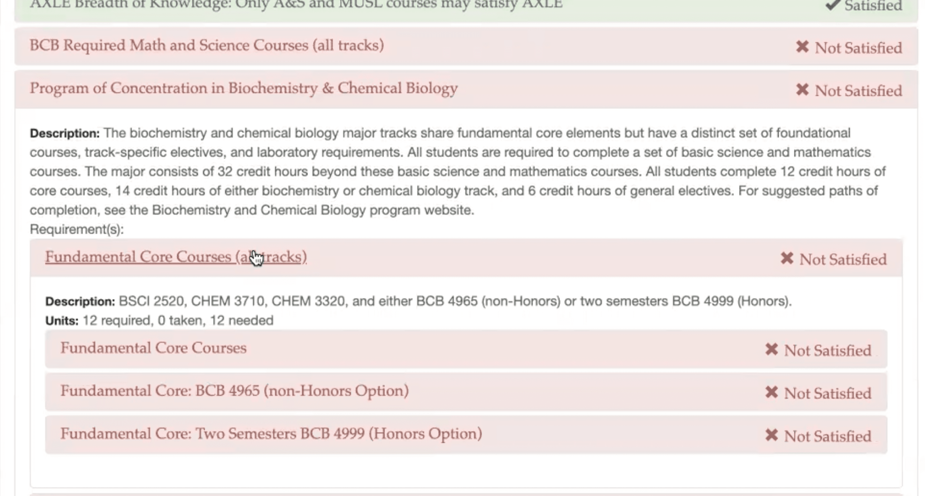
The declaration portal is under “Plans,” but students overlook its unclear label and get lost.
Multiple “Add Course” buttons for a single term add unnecessary redundancy.
The terms “Active” and “Locked” are confusing, leaving students unsure of their meanings and what to select for both.
Some departments don’t align with any undergraduate major offerings, adding unnecessary information.
Mixing vertical and horizontal scrolling creates confusing and awkward navigation
“My major was rejected multiple times because I didn’t know I wasn’t meeting requirements.”
“I constantly have to switch tabs to find information.”
“I didn’t know how to explore my interests when I declared.”
Dartmouth student quotes


#008352
#DBEEDB
#FFF4DA
Aa
Inter

🚨
🚨

