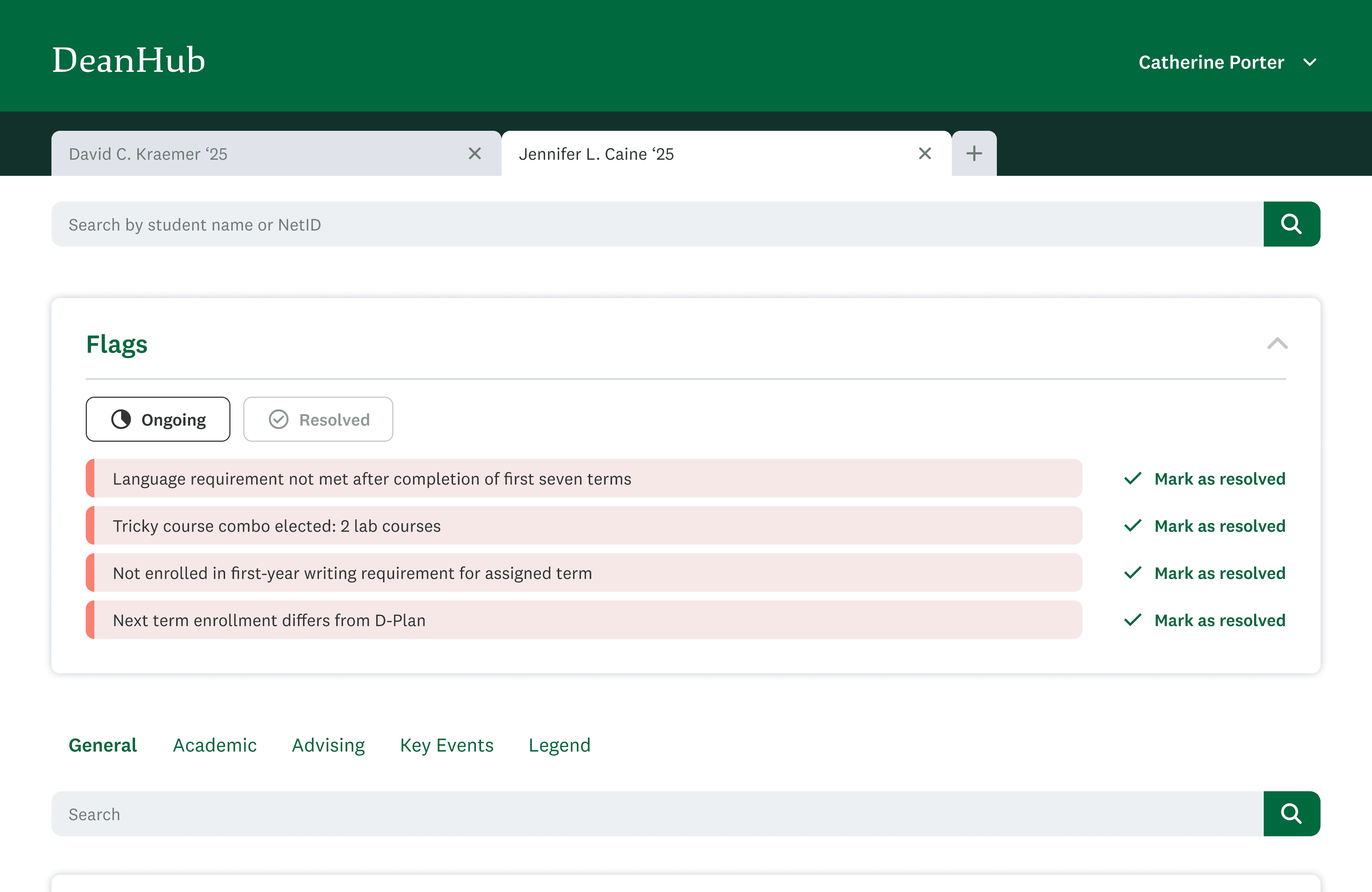
Student Risk Alerts
Flags potential academic risks prominently at the top of the page, enabling deans to provide proactive support before challenges escalate.
Interactive Data Insights
Presents long-term academic data in clear, visual formats, allowing deans to identify trends and make informed decisions quickly.

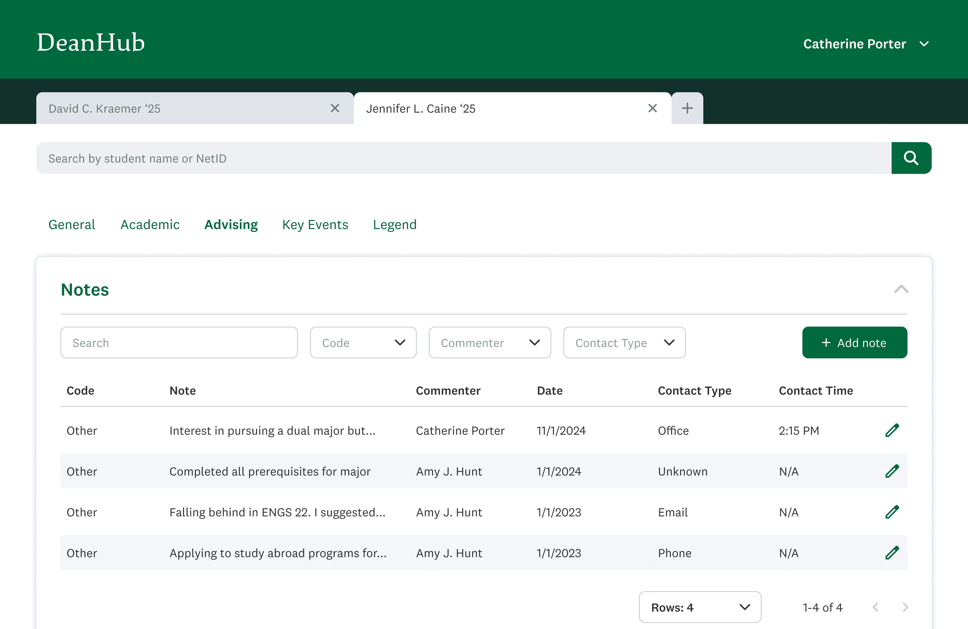
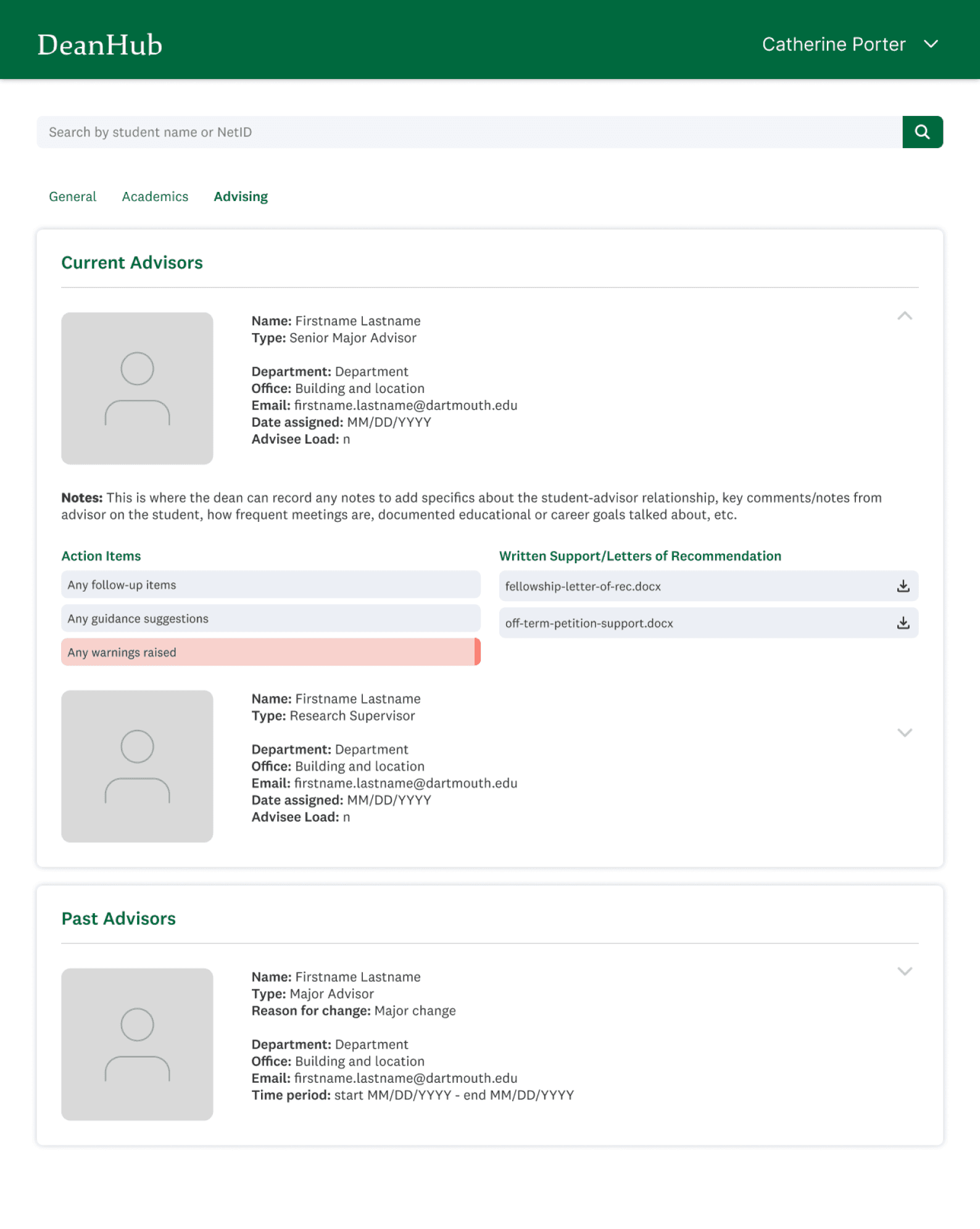
Improved Advising History
Enhances the presentation of advising notes from all meetings with a student, with intuitive filter options for quick access to information.
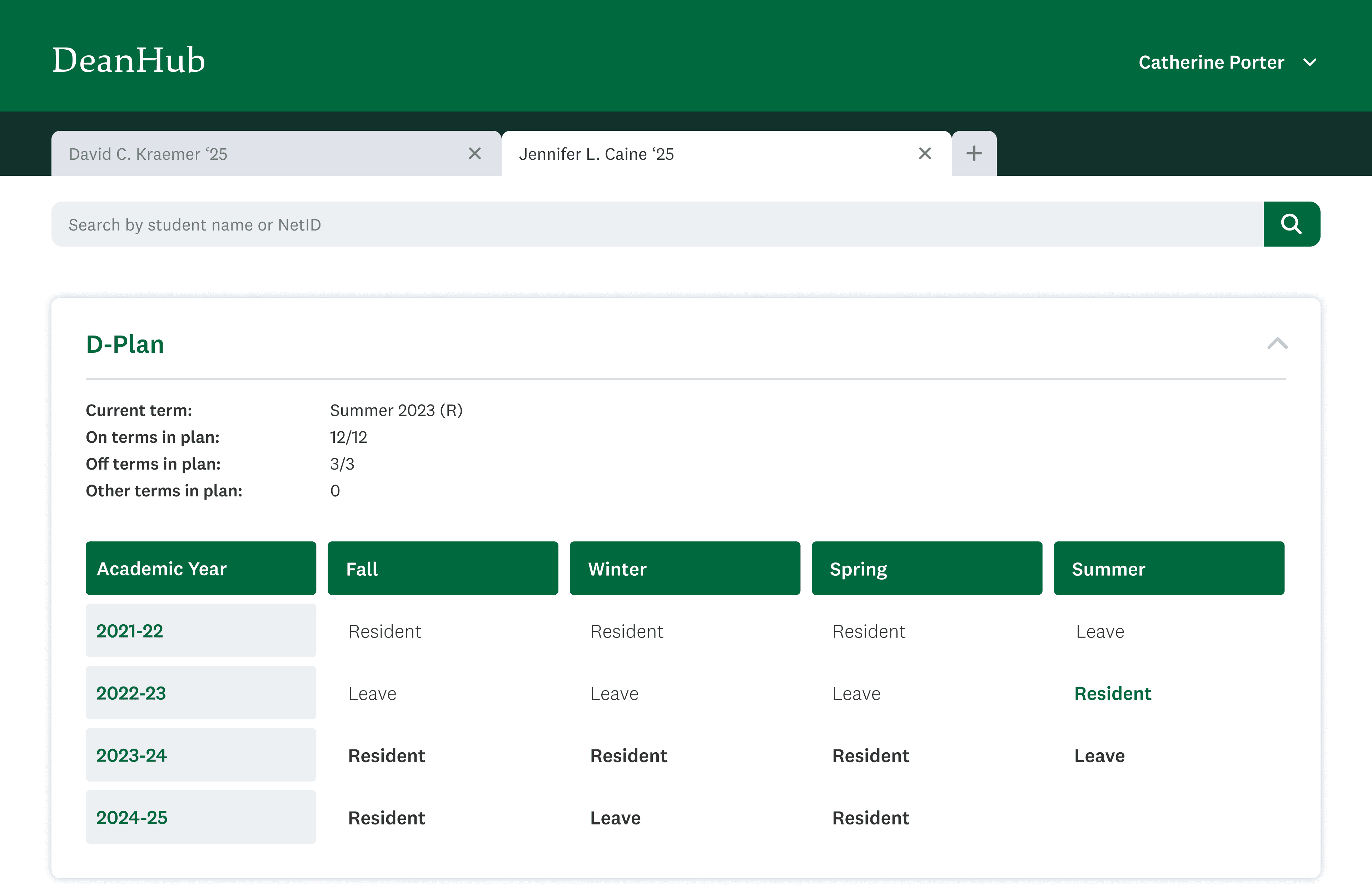
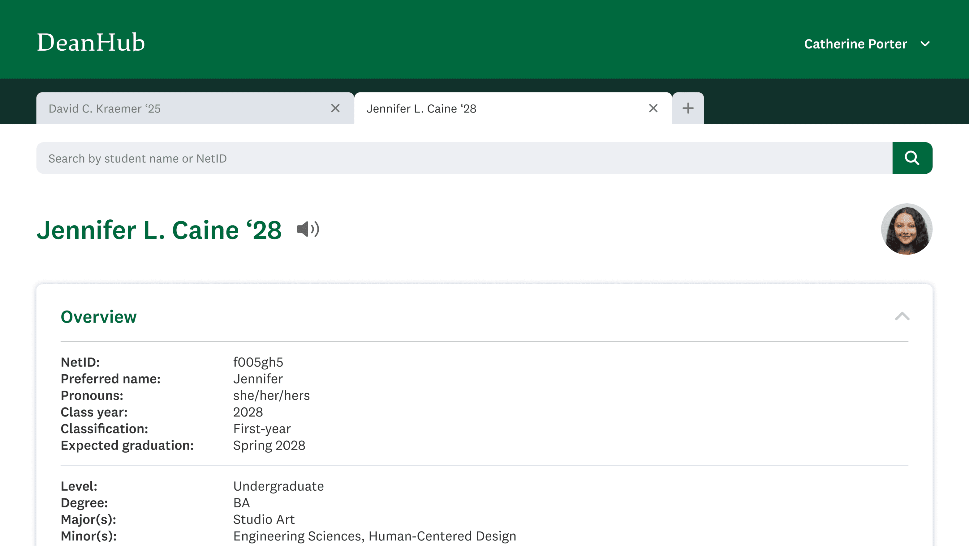
Accessible D-Plan View
Provides easy access to a student's 4-year D-Plan, a critical piece of information missing from the current ABC form.
DeanHub
I collaborated with two other designers to develop a visual dashboard for Dartmouth’s academic deans, improving usability of the current system and centralizing key student data, such as advising history.
Duration
8 weeks
Sep - Nov 2023
Team
3 designers
4 developers
1 PM
Deliverables
Design System
Figma Prototype
Role
UX
CHALLENGE
Dartmouth academic deans struggle with scattered platforms and a lack of automated risk alerts, making it difficult to efficiently access data and proactively advise students.
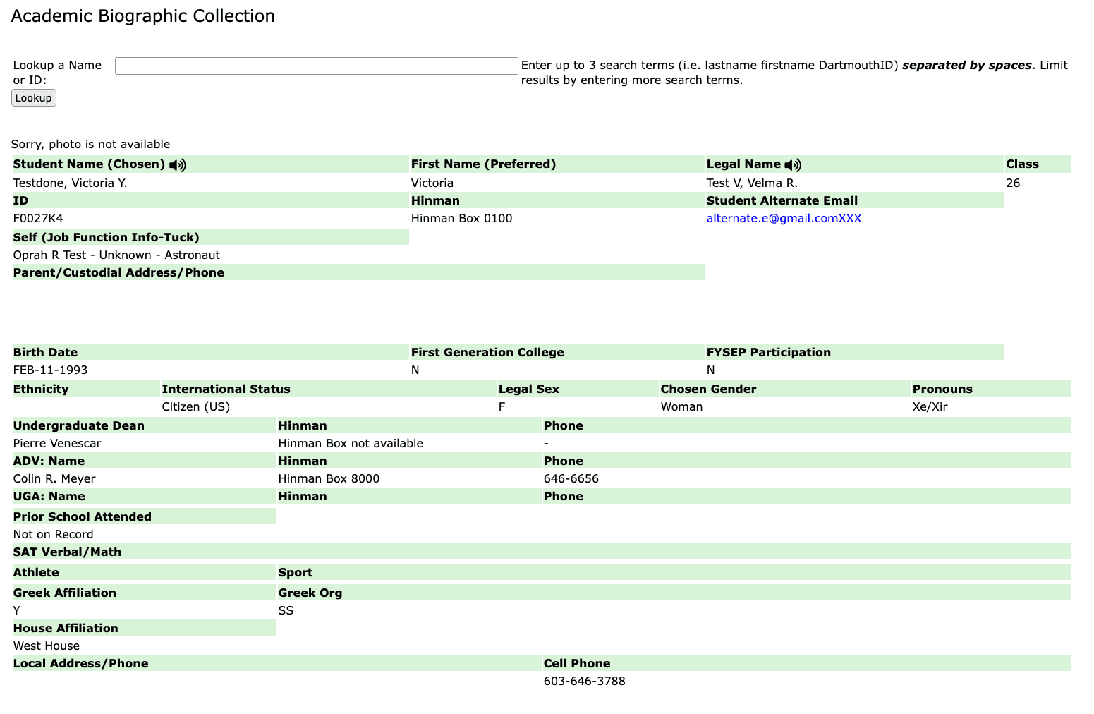
Called the ABC form, the current platform isn’t interactive and lacks access to student milestones or events, leaving deans reliant on students for updates. This gap limits how effectively and proactively they can provide guidance. It also lacks visual hierarchy and is hard to read at a glance.
A portal called DeanHub that centralizes student data into an interactive, visual dashboard, offering access to student academic history, milestones, and degree progress.
We analyzed Dartmouth's other data management systems as well as external database UI examples to decide on an intuitive hierarchy for presenting student information.
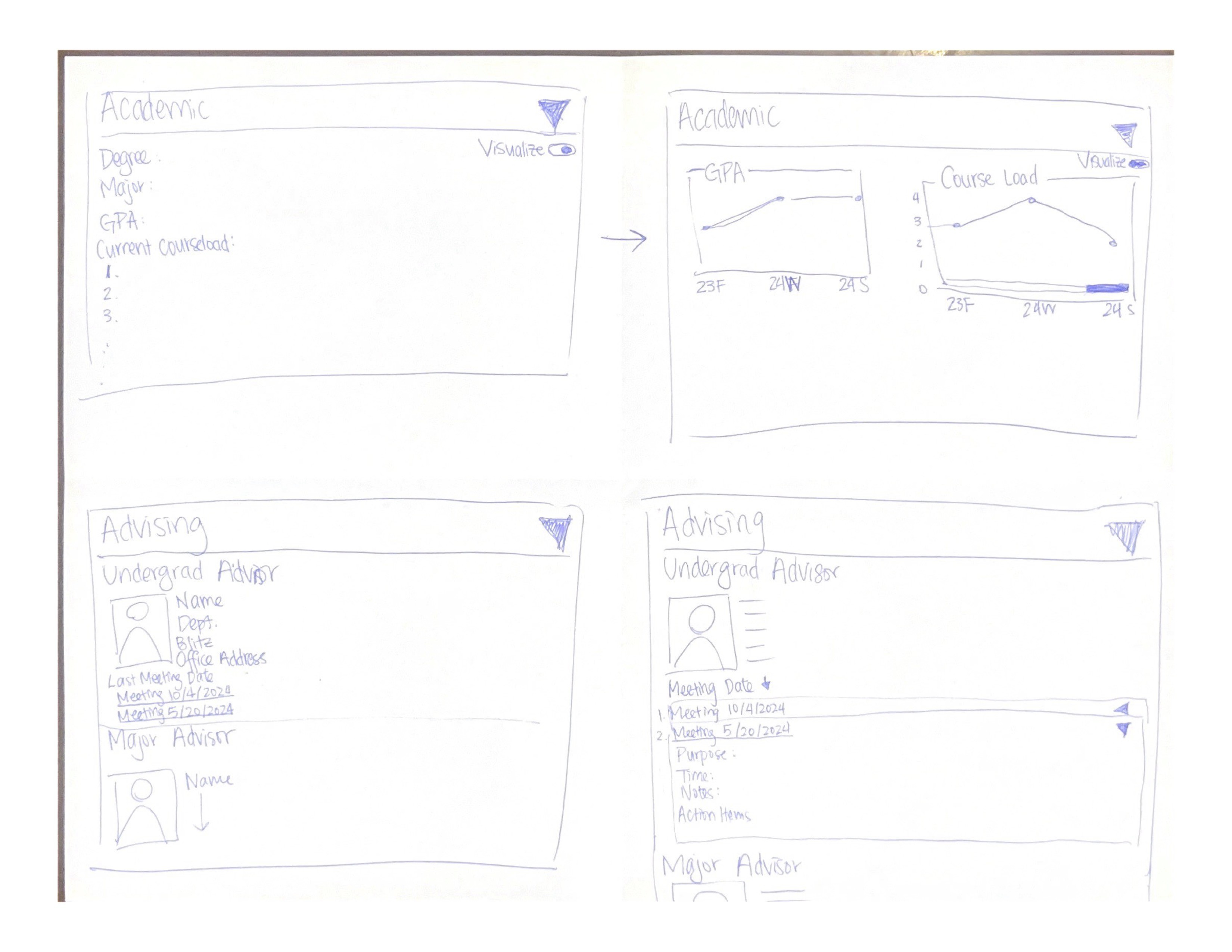
We quickly iterated on how to present information in cards. I proposed splitting content into academic and advising sections, introducing the use of tabs for better organization.
Reviewing the student services hub revealed the use of cards to present information. While we appreciated their clean look and collapsibility, we saw opportunities to simplify them, enabling deans to access key information more quickly at a glance.
Here are the key takeaways from our user interviews:
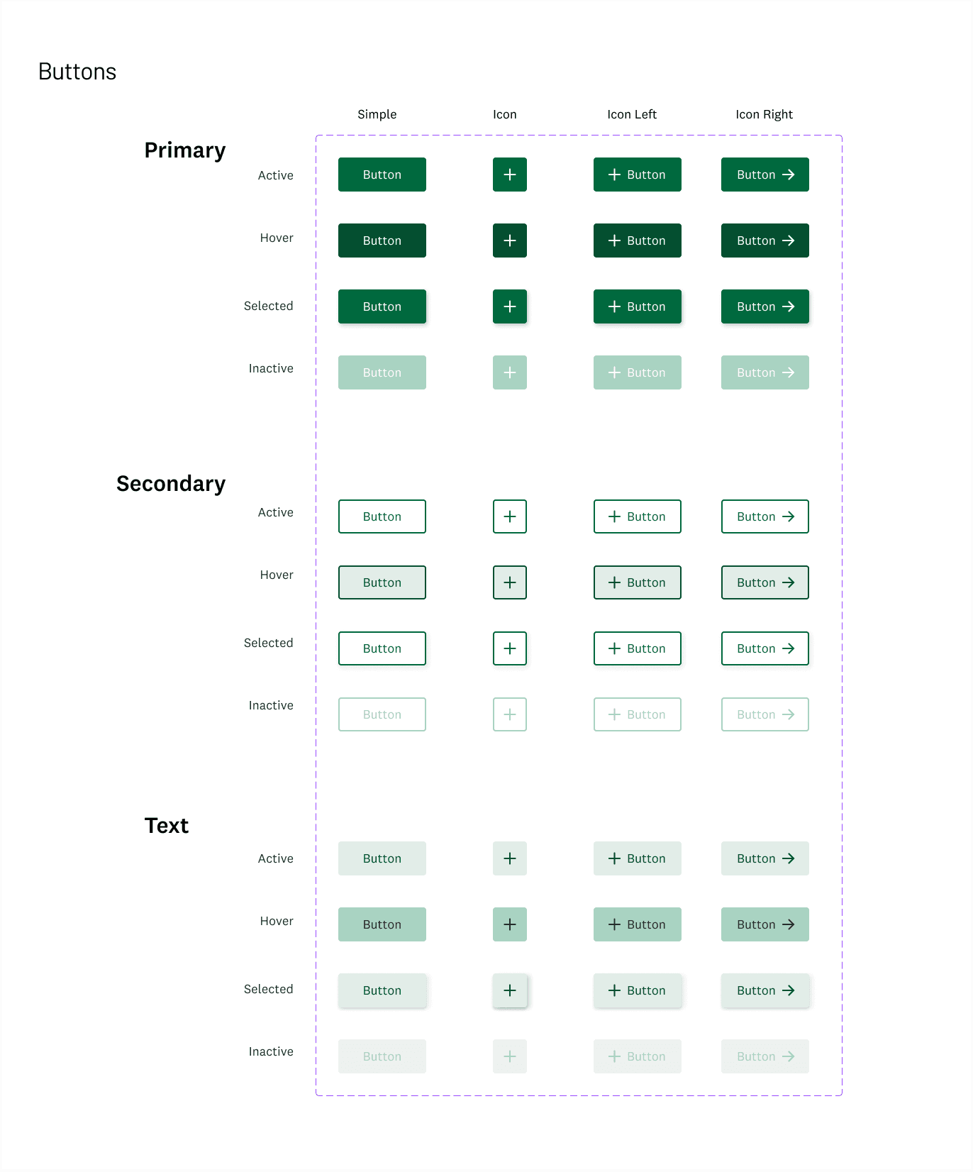
We were able to reference the ITC's existing component library from a past DALI Lab project, which provided us with a ready-made design system.
These stakeholders pointed out that some confidential information was placed incorrectly at lower access levels and suggested duplicating key details, such as the student's major, at the top of the page in addition to its location on the Academic page. They also requested that we prominently display whether a student has signed FERPA at the top of the landing page.
Since we already had an established component library, we skipped the traditional grayscale phase and went straight to high-fidelity designs, using color and incorporating components.
We revisited some of the same individuals we interviewed earlier, along with new stakeholders from lower access levels, such as the First Gen Office and Student Accessibility Services, to make final adjustments before handoff.
The Key Events page remained mostly the same in the final version, with the main change being ensuring color choices didn’t disrupt the hierarchy. The Advising page, however, needed simplification and improved spacing.
I learned how to balance text and visuals on the screen to effectively communicate information. This project was challenging, as we started slightly later in the term due to issues with another project partner, giving us only 8 weeks instead of the usual 10. However, I’m proud of the two other designers and myself for taking charge and diving in right away. Since this is a fast-tracked ITC initiative, I’m excited to see it implemented soon. After launching, the platform will benefit from regular updates and additional usability testing.
Taking the lead on two central needs, engagement metric visualization and improving search functionality within advising history, improved my skills in simplifying complex data.
OPPORTUNITY
Solution
Industry research
Flow Sketches
TAKEAWAYS
Initial Hi-FiS
USABILITY TESTING
Reflection
Final Site
How might we replace the static ABC form with a dynamic solution that keeps deans informed and maximizes their ability to support students?
“We currently have to jump to 2-3 other platforms to get a full picture of a student, which wastes so much time.”
“It would be really helpful to see GPA trends and a visual of how many terms a student has been enrolled.”
“We need different levels of access. For example, the First Gen office should only see First Gen students.”
User interview quotes
This saved us time on developing color schemes and typography, allowing us to concentrate entirely on crafting features that are visually clear, well-structured, and easy to navigate.
We divided the pages among the team, with me taking responsibility for the Advising and Key Events sections.
ITC Component
Library


Deans highlighted the need for clear, accessible data to aid decision-making, preferring visualizations and trends.
Deans want a more comprehensive view of students that goes beyond just grades, including engagement metrics, extracurricular activities, and academic progress.
Deans emphasized the need for early alerts for students at risk academically or personally.


We spoke with an undergraduate dean, now the director of the Undergraduate Dean's Office, and a dean of the College to understand their pain points with the ABC form and how it functions across four different access levels.
Since the platform serves various campus organizations and leadership with different needs, these conversations helped us determine what information to tailor for each access level.
USER INTERVIEWS
Dartmouth Ruzicka
Aa
Proxima Nova
Aa
